Position & Spacing
Clear space
To ensure proper clear space around the logo for legibility and prominence, photos, text and graphic elements must follow the guidelines illustrated here. Use the letter “C” as a measuring tool to help maintain proper clearance.

Extended clear space
When the Cal Lutheran logo appears with another logo - from within or outside the university - the logo requires extended clear space to maintain its integrity, as shown here. No other logo should fall within these parameters.
Note: This extended clear space applies only to partner or co-branded logos. It does not affect the clear space established for photos, text, graphic elements or margins.

Minimum size
To maintain full legibility, never reproduce the logo at widths smaller than 1 inch (for print) or 100 pixels (for screen).

Placement
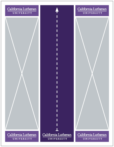
Because the primary logo is center set, the center third of a communication is the preferred placement. Place the logo vertically anywhere in the document, but ensure it’s centered horizontally.
If the center zone is unsuitable, place the logo in any of the four corners, following all clear space requirements from the edge of the page.
